
photos from the enchantments [2]
A Study in Water
these pictures are from my latest annual backpacking trip with steve. you know the drill. i'm lookin' for photography advice. that is, let me know how i could have improved these fotoes AND whether any of them appear print-worthy (an * means that i'm considering them) AND any other thoughts regarding the pictures or my time in the enchantments.
1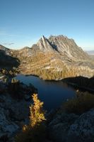 2
2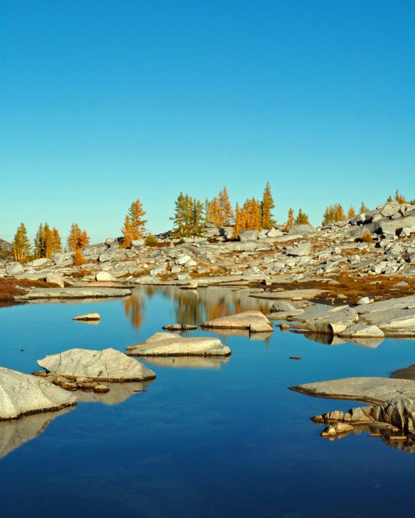 3
3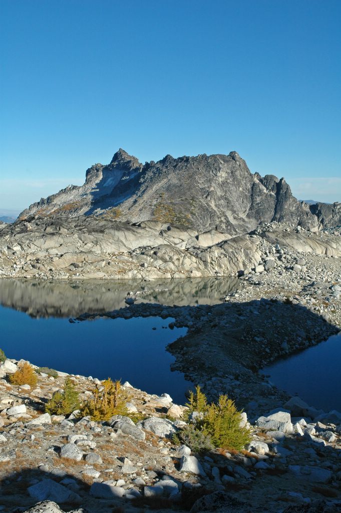 4
4
5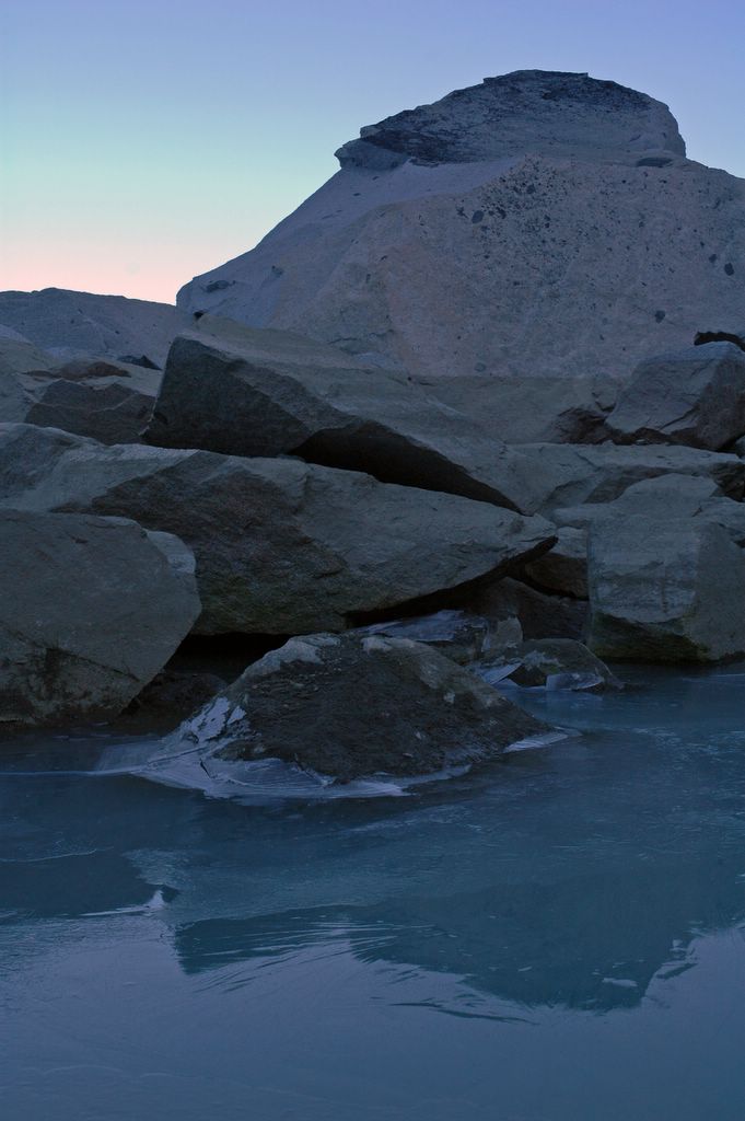 6
6 7
7 8
8
9 10
10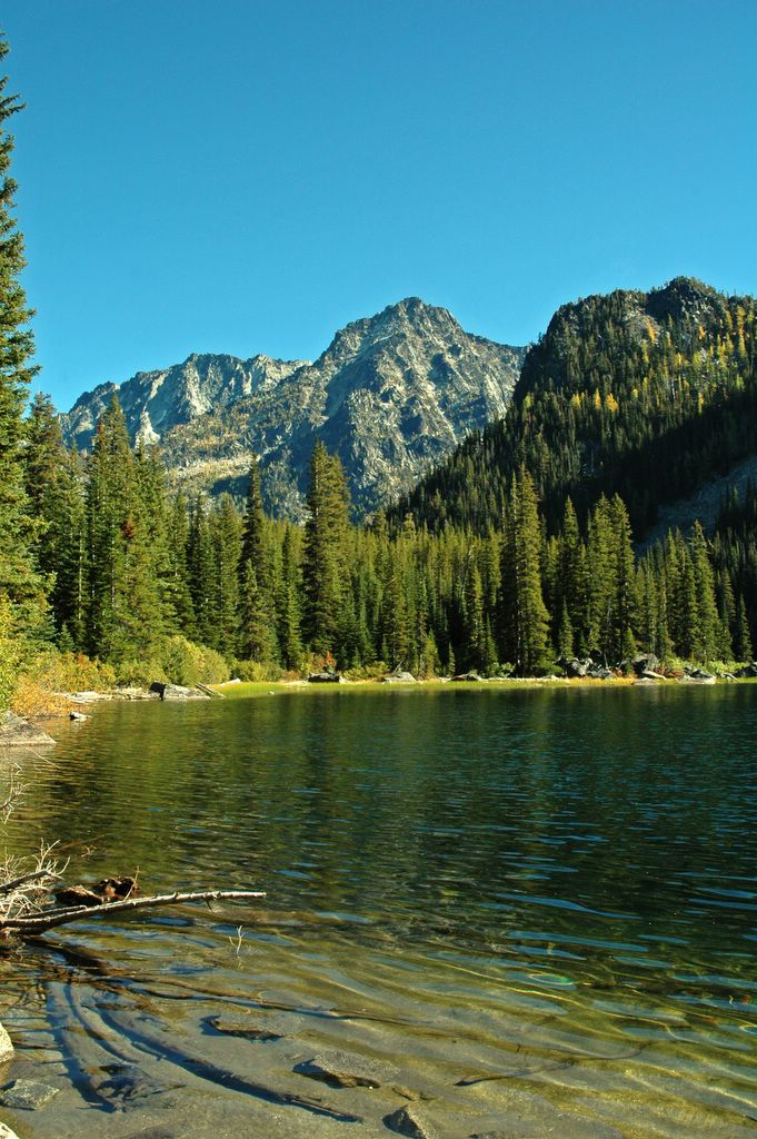 11
11
1. Andrew David 'Losing daylight' somewhere in the enchantments -- the shade ruined any hope for this picture
*2. Andrew David 'Stepping Stones' somewhere in the enchantments -- i considered cropping some more sky, but this seemed the best fit
3. Andrew David 'Africa' somewhere in the enchantments -- again, shade. but do you see africa?
*4. Andrew David 'Quiet' Lake Solitude -- if only there were a bit more colour in those distant trees.
5. Andrew David 'Ice' nearby Lake Solitude -- as the bear sat his weary rump on the ice, he complained that 'my friend's out there rolling 'round the basement floor, and someone saved my life tonight, sugarbear.' sugarbear said nothing.
6. Andrew David 'Proof from Sum' Colchuck Lake --
7. Andrew David 'Proof from Summit' Colchuck Lake --
8. Andrew David 'On Little Galilee' Colchuck Lake's little buddy lake -- i like steve.
9. Andrew David 'Colder from Above' Colchuck Lake --
10. Andrew David 'Typical Lake Shot' Lake Stuart --
11. Steven Van Selus 'Playing with Weeds' Lake Stuart -- i like red shirts.
1 comments:
I am a big fans of shots with people in them since it adds a time frame and a relationship like interaction so #8 and 11 are the best too me. Esp #8. I like the ripples, the reflection, and the relationship of man Vs nature.
#2 is good. Somehow the orange trees make me keep thinking that the exposure was wrong but I know that is what the trees really look like up there. I do think that some kid of crop would add to the feel rather than the horizon in the plain middle. However the gradient of the blue in the sky is great and it would be a shame to lose that. Maybe a crop that cuts a little off the top where the gradient is less noticeable and some off the bottom so that the rock features are off the picture leaving the imagination to fill in how far the lake goes.
#4 is one you selected as a might print. the relfection in the water is great. maybe you could select the shadow in photoshop and bring out some more light and color in that area.
#9 would be a great one if the time of day or angle of the sun were different. I have noticed that all pictures need a foreground and a background but either of these could be the focus. This one show that the sharp foreground adds interest and context to the picture but it is the back ground that is really teh point. Good composition and framing on this one.
Cheers,
Chadius
Post a Comment