
Alaska pics 1
I'd love to hear feedback on any of these pictures or opinions on which, if any, to print & frame. pictures with an '*' are currently under printing consideration.
1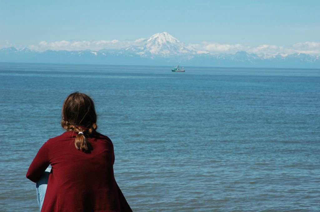 2
2 3
3
4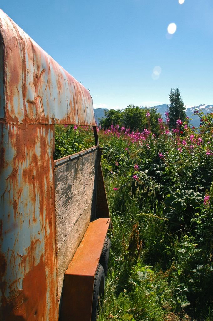 5
5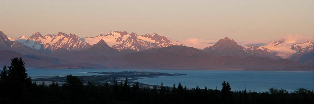 6
6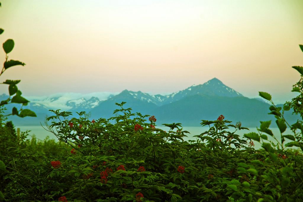
7 8
8
*1. Andrew David, 'Pensively Beth' Ninilchik -- i think this might have been nice with a little more colour and contrast
*2. Andrew David 'Mt. Redoubt' Nilnilchik -- for some reason mt. redoubt didn't live up to its name in this pic. if it were bigger and brighter, it would offer more contrast to the flowers. as is, its too...backgroundy
3. Andrew David 'Nilnilchik sign' Nilnilchik -- not sure why i decided to post this one. i think i just like signs.
4. Andrew David, 'Potholey Road' Homer -- i like the rust in this picture, but not sure how to accentuate its coolness. oh, well. we actually had to turn back on this road because the potholes and 70% grade would have capsized our rigs.
*5. Andrew David 'Spit' Homer -- perhaps the colours are too washed out here...? i was hoping to let Homer speak for herself.
*6. Andrew David 'Homer berries' Homer -- as you can perhaps tell, i'm not great at night photography (this is at 11:3o or so). i was hoping that the berries would be a little bit more like my shirt in picture #8 -- bright red
7. Andrew David, 'Searching' Ninilchik -- i like this one of beth and the ruffles eating stranger.
8. beth the s.o. 'Run aground' Nilnilchik -- about 60 years ago, when they first built this boat, they apparently had sky-coloured paint.
6 comments:
great cropping job on the Homer Spit one. And I still like the berries picture. The coloring is cool. (more please!)
thanks. fyi, the cropping on photo 5 is a standard size; that is, you could print it on mpix.com w/o any additional cropping.
i'm glad you like it. the sky has an odd green hue that i don't really understand.
I really like the #7-Searching one. Beth has a quizzical/bemused look.
ip chicken?????
hey, me too...i wasn't quite sure how to describe the look, but i think you nailed it. i think the pic captures her usual attitude toward me quite well. i don't know how i should take that though...
I like photo #1 if you crop the right side (maybe make it 8 x 10 dimensions) and if you straighten the horizon.
I would have liked #2 if the composition was different.
Photo #5 is my favorite
The guy in #8 is HOT!
gosh, i didn't even notice the crooked horizon! how funny. i'll definitely try cropping it, but i'm still afraid there's just way too much blue in that picture, and the mountain's just too far away.
what do you mean? how should i have done the composition. (i have some other shots of the same scene, i wonder if you'd like them better; they're pretty similar though, so probably not)
maybe. i wonder if would print alright.
i agree.
Post a Comment